
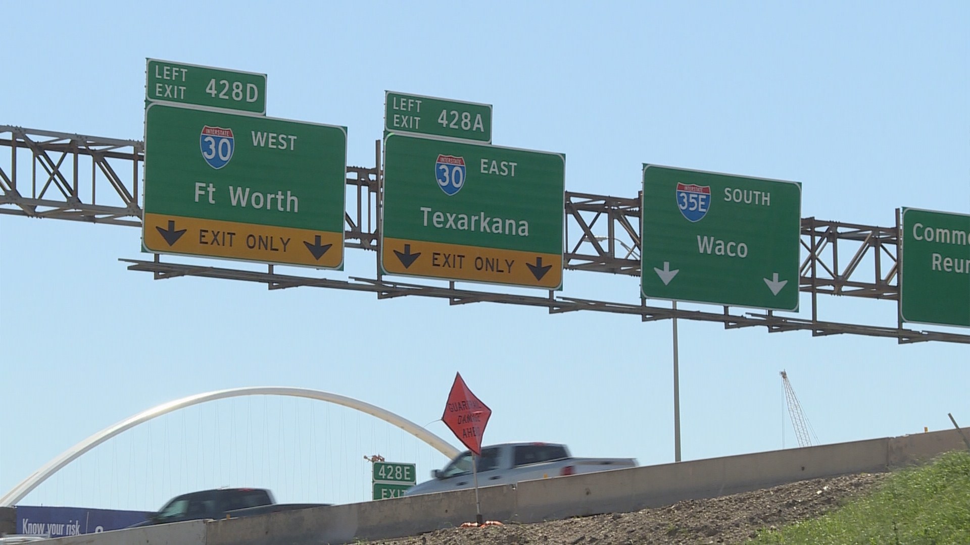
DALLAS -- For more than 10 years, it's been a familiar sight on Texas road signs -- even if you've never taken the time to notice it.
It's the font that's used on signage across the state, known as Clearview. It's designed to be easy and fast to read, improving public safety, but now Texas and other states may have to abandon the font due to a decision by the federal government.
Texas was one of the first states to adopt the font, which has been studied extensively by researchers at Texas A&M and other institutions. It was conceived and designed by Don Meeker, who developed the font and encouraged its adoption starting more than two decades ago.
"No state that has made a commitment to Clearview has turned back," Meeker said.
But the Federal Highway Administration now says that the benefits of the font are overstated and point to costs states pay to license the font.
Meeker's company sells software with the typeface to state departments of transportation. He says the costs have never totaled more than $1,500 per state, which amounts to less than a penny a sign.
Clearview is Example A above.
"If we can add one or two seconds to an older driver's reaction time, we've made a great contribution to safety," Meeker said.
TxDOT wants to continue using Clearview and is appealing the Federal Highway Administration's decision. But pending that appeal, it will switch to the standard highway lettering on new signage.
Existing signs do not need to be removed, but as they age, they will be replaced with signs without the Clearview font.
Does it really make a difference to the average motorist?
Tuesday, WFAA News 8 took the question to Klyde Warren Park. With sample images of a sign in Clearview and standard highway font, folks were asked which they preferred in a very unscientific survey. Nearly everyone preferred Clearview.
"It seems easier to read," said one participant.
Keisha Whaley, a graphic designer, pointed to differences in the spacing of the letters, calling Clearview the better option.
"With signage like this, when you're talking about driving and you're appealing to so many different age groups, [the font] is important," Whaley said.